Pic

Pic

Wednesday, May 21, 2014

vintage little girl's room

We've just about completed my daughter Juliette's room:) Seems like it has taken forever to get here.  In case you haven't read my blog before, we have been remodeling our home for a few months now all to add a 3rd bedroom after having our second child (her older brother was tired of sharing his room.) The theme I had in mind was more of a vintage child's room but with some modern elements. Something that can grow with her over the years so I won't have to change it anytime soon. I like the more neutral color palette and I think pastels are just so sweet for a little girl's room. I wanted it to be pretty but at the same time practical and fun for her.


So far she really loves her new room and I have had so much fun putting it all together! I have a few more finishing touches that I'm going to add, my childhood dresser being one of them. I'm so excited about that and I will post pictures as soon as I get it.


I always love your thoughts and comments and I am always looking for more fun blogs to read!
Thank you for stopping by!


Monday, May 5, 2014

little boys room

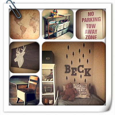
Now that we have finished the master bathroom it's on to my little boys then my daughters after that. Hopefully by the beginning of summer we will have it all finished where we can all relax...for a little while anyway. Over the weekend I finished my sons room. Nothing too big but just changes to go from a toddler room to a "big boy room." Since his sister is finally moving out of his room that they shared to her own room, he wanted a new look too. I put together a little collage of some pictures to give you an idea of the new changes.


Thanks for stopping by and hope everyone has a happy Monday and a wonderful week ahead. The kids and I are going to enjoy this beautiful day!

Monday, April 28, 2014

new bathroom reveal

We have been working every extra second we have on this bathroom...and now it is pretty much done! So excited to finally have a master bath in our bedroom. My husband and I found this older dresser and repurposed it into our vanity. We bought a square wall mount sink at Home Depot that worked perfect on top. My husband had to do a lot of wood working on the drawers to box them in for the plumbing and try to give us as much usable storage space as possible. He was able to make all the drawers function which was my goal. We decided to use mostly glass in the shower because this is not a very big bathroom and with no closed in spaces it gives it the illusion it is bigger than it really is. I got the light base part in oil rubbed bronze at Home Depot as well. It was just the flat base that goes against the wall..it did not come with the globes (I didn't like any of the options for the globes they had.) I went online and found a website that sells the light cages that are used to cage in lights on constructions sites. They were originally a brass color and I sprayed them with oil rubbed bronze spray paint. I was pleased how they turned out.  Hope you all like it too! It was so much fun designing and picking out all the details but I am sooo glad it is finally done and useable! Now on to the next project:)


Savvy Southern Style

Wednesday, March 12, 2014

kids study nook

This is a project I've been slowly working on for a while and I have finally just about finished it. It took a little longer because of planking the wall and building the floating shelves and desk. I collected items for months that I wanted to style the shelves with. I wanted to make it all cohesive with the theme of studying and learning and this is what I ended up with...


I have numbered pots, an old tin lunch box, a flash card I made to look vintage, metal tool box, books, vintage scale and some wooden squares from Michael's that I painted with chalkboard paint then wrote the word "study." The desk is just a large piece of wood I stained and is held up by old corbels that came from an early 1900s house. On the side wall I made eye charts with my children's names. I made them on the computer one late night then framed them not sure how they would turn out, but I really like them. 


The red chair was an afterthought. I had their chair downstairs and it was solid wood from pier 1. I stained it originally and it turned out good but it was a little too much wood going on for me in this area. The back door is right across from this nook and it is painted red. So I took the leftover paint I had from the door and did almost a whitewash (I guess it would be a redwash then?) to the chair so you can still see the wood grain and some variation in the darker wood spots. It added just enough of a pop of color.


I was happy that with all the remodeling we were able to use every inch of space and try to make it useable. I had always wanted a study nook type of space for the kids to color and draw and one day be able to do homework at:)
I will do more detailed tutorials on the planking and floating shelves another time.

Hope everyone is having a good week so far! Thanks for stopping by!


Savvy Southern Style

Wednesday, March 5, 2014

DIY faux wood laundry/pantry doors

Hi everybody! I've got a million projects going on right now but I thought I would share my latest one I have finished. If you have been following my blog then you know that I had to move my laundry room to a laundry closet off the kitchen so we could add back a 3rd bedroom. We framed up the closet and added all the plumbing and proper vents. Then it came to picking out the doors. I wanted a small French door look. It needed to be pretty since it is in the kitchen and well be seen all the time. I also wanted it to look like pantry doors so you would never know it is a laundry closet. We are on a budget so I search the materials section on craigslist often. One day I came across the perfect set of doors and it was exactly the right measurements...that never happens! The man said he got them at Lowes I believe and just never used them. They were new but were stored in his garage so they had got a little banged up and definitely needed a little work. We got them hung and at first I was just going to paint them white like my cabinets but then I thought these would be the perfect piece to do something a little different and something that pops in the kitchen. I have a few wood pieces here and there and the doors have a wood grain look to them (I guess it's in the door mold because these are not wood doors.) So I then decided I wanted to try a faux wood look and give them an aged look like they were 100 year old doors that I spent a lot of money on :)
   Here is the finished product...


Now I'll give a step by step tutorial for anyone that wants to transform any plain door you have 
around the house. First I stained it with a dark walnut stain. As you can see in the picture below the 
white door is the original and the other is the stained door. After I stained and wiped, it didn't turn out extremely dark because it didn't soak up the stain like a real wood door but it did enough to give it a wood base color for when I do my faux finish. This is important because if it didn't have a base color then when I do the darker color later and streak it, the white would show through and not the lighter stained wood color that gives it the real wood look.


Also if you notice the darker spots in the stained door..those were on purpose lol  I wanted a real authentic looking aged door and there are always blemishes and imperfections in very old doors so I found a way to replicate it. Before I stained I took DAP spackling and smoothed it in a couple areas 
like around edges and let it dry. Then when you stain, it stains the spackling darker then the rest of 
the door thus giving it age spots.


This is some of the spackling before stain...


This is it after stain...


After the stain has dried then it's time for the faux wood coloring. I mixed my own because I couldn't find the perfect color. I bought Valspars "journey" and then mixed a little black to it to get the deep rich brown.


Then I put a little paint on my brush and lightly brushed it on. You don't want too much paint on the 
brush or it will go on too thick. If it does go on thicker in spots just take a rag and wipe it. It needs to be very thin so you can still see the wood grain if your door has that.


The darker paint gives it the walnut wood look but you can also still see the variations of the lighter stain peaking through. Here are some more up close pictures so you can see the wood grain and color.


This is the finished door next to the white door.


Then you repeat those steps on the other door and the inside of both doors so it truly looks like wood doors when you open them. I did the trim also using the same technique so it all looks like one big old set.

Here are some finished pictures. I still need to spray paint the hinges to match the doors better. I ended up using some old white porcelain door knobs I already had instead of the oil rubbed bronze ones I had purchased from Lowes. The white just stood out more against the dark wood and went with the vintage theme I was trying to go for. 


I also added a little nook above the doors for extra storage and I thought it looked better than just framing it up and putting drywall all the way to the ceiling.


Hope you like them...it definitely gave the look I wanted. That is the first thing everyone notices when they go into the kitchen. If you want to try this, it really only took me a couple hours per door to do so it is a manageable project. 


Savvy Southern Style

Monday, February 24, 2014

DIY moss balls

How was everyone's weekend? I thought today I would share my DIY weekend project. For a while now I have been wanting moss balls for decorating but everywhere I have seen them they are $10+ a ball so after buying 4 you would have $40 invested in moss balls. I always thought that was a little crazy so I've never went through with it. Well this past week my husband picked me up an adorable shabby coffee table at an estate sale. As I was pondering what I wanted to put on top of it I came back to the moss balls. I was determined now, so on Friday I went to Joanns and found the solution. They had a nice selection of the bags of moss and had the perfect color that I wanted (I like the deeper green color.) I grabbed the last 2 bags and then bought a package of the styrofoam balls that were on sale for 40% off. I used my 40% off coupon for the moss then they also had a 15% off coupon off your entire purchase. Long story short I got the materials to make 8 moss balls for a little over $10. I was so excited...I love that store!


      This is a picture of the bag of moss I purchased.


This is after I hot glued moss on the styrofoam ball. I was pleased with the outcome.


This is a picture of the top of the coffee table. All of my moss balls are in a glass atrium type piece that I scored at TJ Maxx on clearance for $10. I loved the nautical type look of the knotted rope on top and the wooden bottom. I found this cute wooden basket with leather handles at Target. It was a raw wood color so I stained it a little darker to match all my other wood tones in the house and it gave it a more aged look I think too. Then I had 2 old vintage books I took from my collection and added them to the vignette as well because they were the perfect size and filled up the space nicely.


This is all of it together. This is the new (old) coffee table. I love the shade of green it is. 


I added the stained crates underneath because they were a perfect fit and added extra storage and I'm all about extra storage. I store blankets, a pillow and magazines underneath right now.


I didn't have a coffee table before so I'm so happy now we have a place to put drinks and feet and anything else we want. My son has already used it for a racetrack for his matchbox cars so it seems the kids like it as well:) It's a beautiful day today so I think we will spend much of it outside. Hope everyone has a good week!


Monday, February 17, 2014

open shelves in kitchen

For a long time now I've been wanting some open shelves in my kitchen. There's not a whole lot of options for places to put them in my kitchen except for one spot on the end by the hallway. It's also the spot that is most visible from other rooms in the house (if you are going to display your pretties, you want people to actually see them:)) So I had been contemplating this for months and I finally made the decision to just do it. My husband has been super busy with the bathroom remodel and doesn't have time for all my little side projects I come up with so I thought I would just tackle it myself. I decided to leave the cabinet base there and just remove the door. That way if for some reason I ever decided to go back to wanting the cabinet, I could just add the door back and call it a day. I also like the way the cabinet base framed the shelves and it all flowed nicely with the rest of the kitchen. I then removed the ugly shelves that were inside. I went to Lowe's and bought a sheet of stain-able grade wood. I traced the old shelves onto the new wood so I had exact measurements then made my cuts. I then took my stain that I already had from staining my dining room table and stained the newly cut wood.


I then painted the entire inside of the cabinet the same color as the outside of the cabinets (which is like an antique creamy white) I think it's a pretty contrast to the dark stained wood.


I also used the existing gold little brackets that were already in there to hold the shelves up but I spray painted them oil rubbed bronze, which is my go-to spray paint that I use on so many of my projects. 
(Sorry forgot to take a picture of the before and after of that).


Here is the finished project that I did by myself in very little time and with very little cost. 


One day I may end up taking out the cabinet base and do complete open shelving but for now I am very happy with the outcome. I now have another place to display some of my treasures and it breaks up the boring row of white cabinets with some visual interest. Hope you like too!